Brand Guidelines

Our brand identity is a reflection of who we are and what we stand for. Consistency in branding is key to ensuring that our message is clear and impactful. Explore our brand guidelines to discover the elements that define us and download the assets you need to represent our firm effectively.

01. About Our Firm

Tagline:

Make everyday places

extraordinary

Firm Bio:

Founded in 1979, we are a full-service, award-winning design firm dedicated to making everyday places extraordinary. Our depth of experience in architecture, planning and interior design means that we take a comprehensive approach when designing the mix of uses that create community.

02. Logos

Primary Logo:

This logo should be the preferred choice in most cases when there is familiarity with our brand. When using our primary logo, it is imperative to maintain its integrity by not making any adjustments. Avoid stretching, distorting, or altering any aspect of the logo. This consistency ensures that our logo remains instantly recognizable and reinforces our brand’s visual impact.

Secondary Logo:

This logo should be the preferred choice when the audience may not be familiar with the brand or what we do. When using our secondary logo, it is imperative to maintain its integrity by not making any adjustments. Avoid stretching, distorting, or altering any aspect of the logo. 

Logo Clearspace:

Let it Breathe.

A clearspace equal to the vertical height of the lowercase wordmark must be maintained around the logo in every application. This applies to both logos.

03. Color Palette

Primary Colors:
Our core brand identity is anchored by our primary colors, which were meticulously chosen based on the materials and color schemes found within our Long Beach headquarters.

Nero

Hex:
#191919

Arancio

Hex:
#eda337
Bianco
Hex:
#ffffff

04. Typography

Titles & Headings

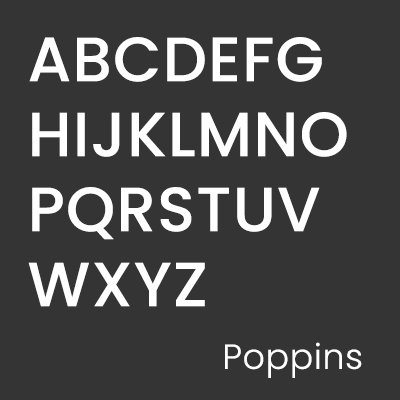
Typeface: Poppins Regular

Poppins Regular
abcdefghijk
lmnopqrstu
vwxyz
Typography plays a significant role in shaping our brand’s visual identity. We have chosen the Poppins typeface to convey a modern, approachable, and professional aesthetic. For titles and headings, please use Poppins Regular to make a bold and impactful statement. Its clean lines and versatility are ideal for commanding attention.
poppins regular
abcdefghijk
lmnopqrstu
vwxyz

Body Text

Typeface: Poppins Light

Poppins Light
abcdefghijklmn
opqrstuvwxyz
In contrast, Poppins Light is designated for body text. Its clarity and readability ensure that our message is communicated effectively.
poppins light
abcdefghijklmn
opqrstuvwxyz

05. Assets & Templates

Open Asset
Open Asset is RDC’s cloud-based digital asset management solution. It offers a centralized hub to store and easily access the latest images, renderings, and videos – all searchable by project name. Its cloud-based accessibility ensures remote availability, eliminating the need for RDC-S111 server access, and maintains synchronized links while simplifying the download and integration of assets into programs like InDesign and PowerPoint.
Templates

Fonts

Letterhead

Logos